# Column Insights
This section of Data Prep gives users an insight into the features within your dataset. Every column name has a
 symbol next to it which can be clicked to view more detailed insights.
The column insights section has several powerful functions to help you understand whats going on in your dataset:
- Ranking columns in order of importance
- Dropping columns which are non predictive (aka feature selection)
- Drilling down into column details:
- Distributions
- Histograms (
numeric) - Value Counts (
categorical)
- Histograms (
- Correlation vs target
- Values over time (
datetime) - Words vs target (
text)
- Distributions
- Identifying and dropping features which leak the target column
# Accessing column insights
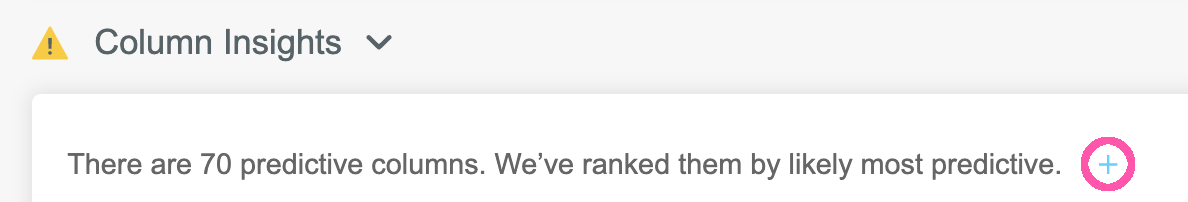
Firstly we need to expand the list of columns, by pressing the + symbol (circled in pink here).
We now see an expanded list of columns, with the most predictive column at the top:
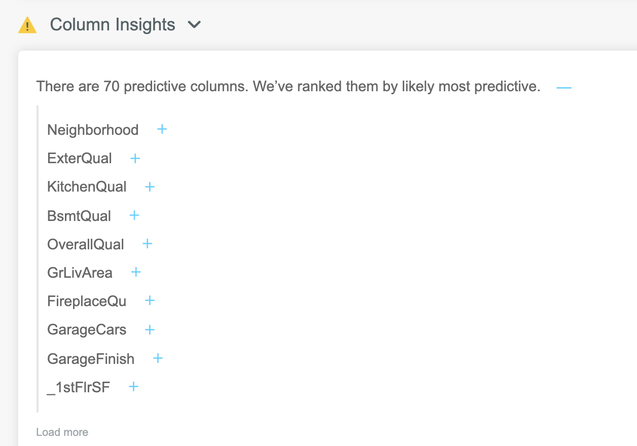
Each column in this list can be expanded to display a range of useful metrics and visualisations. To view details of any column, click the + symbol to the right of the column name:
The exact view depends on the data type detected in the column - numeric, categorical, text or date.
Lets take a look at the different views we get when expanding different types of columns:
# Column details: numeric
Expanding a numeric column gives an array of details around the distribution, missing values and outliers.
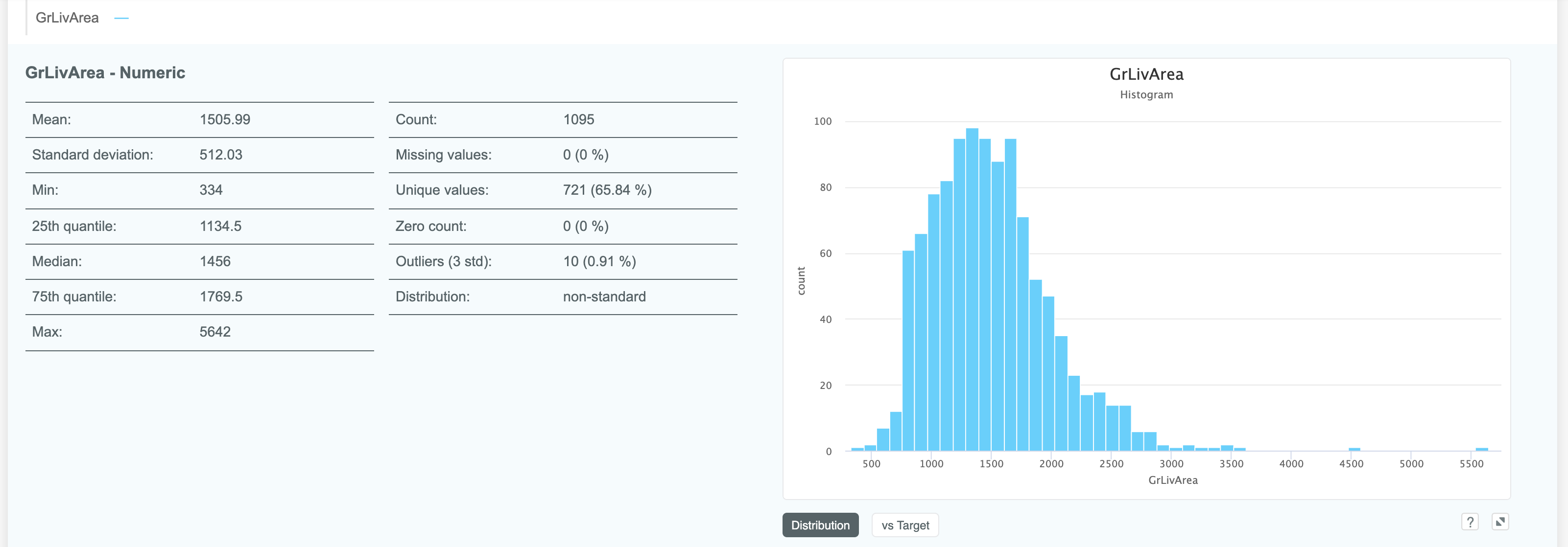
The graph on the right is a histogram by default, but can visualised against the target by clicking the vs Target button:
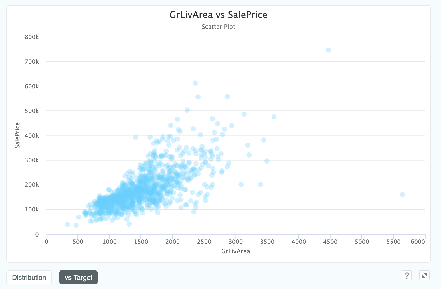
This view shows the joint distribution between the target column SalePrice and our column GrLivArea.
Note that in this model our target, SalePrice, is a continuous variable (i.e. a real number with an infinite range of
possible values, rather than a category).
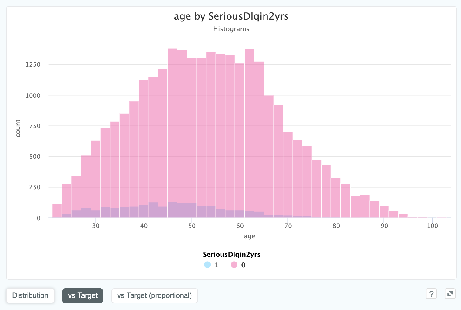
If we have a binary target, in this case SeriousDlqin2yrs (a flag for if a customer went into debt within two years),
we will see the two distributions overlaid on each other:
We can also see a proportional representation against the target, which can be helpful in cases where the ratio is unclear:
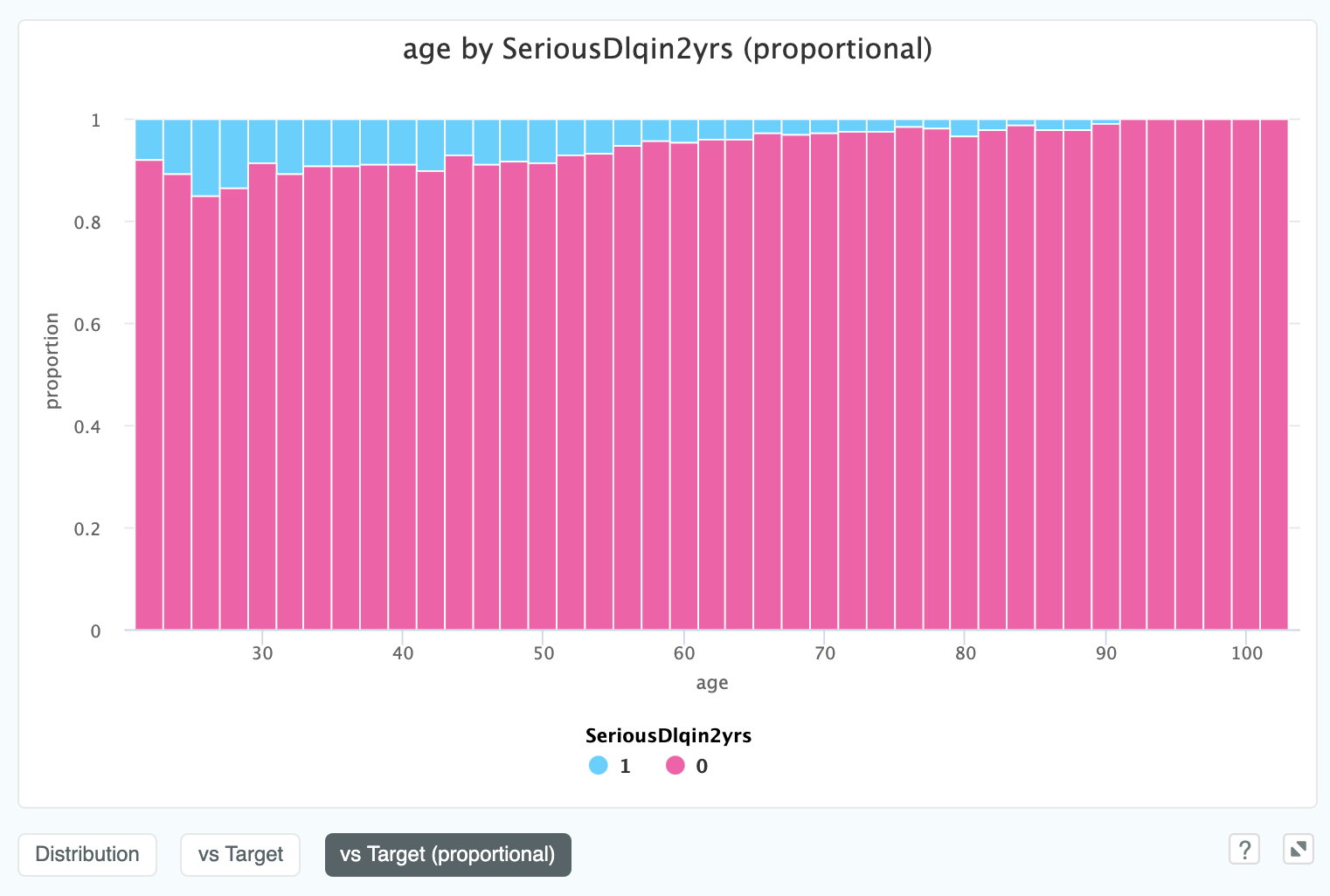
In this view it is much easier to see the relationship between age and SeriousDlqin2yrs.
Apparently the older you get, the more credit worthy you are!
Finally, if we have a date_index in our data, we can view the numeric value over time. In this example we are looking at
the closing high price for Apple stock over time:
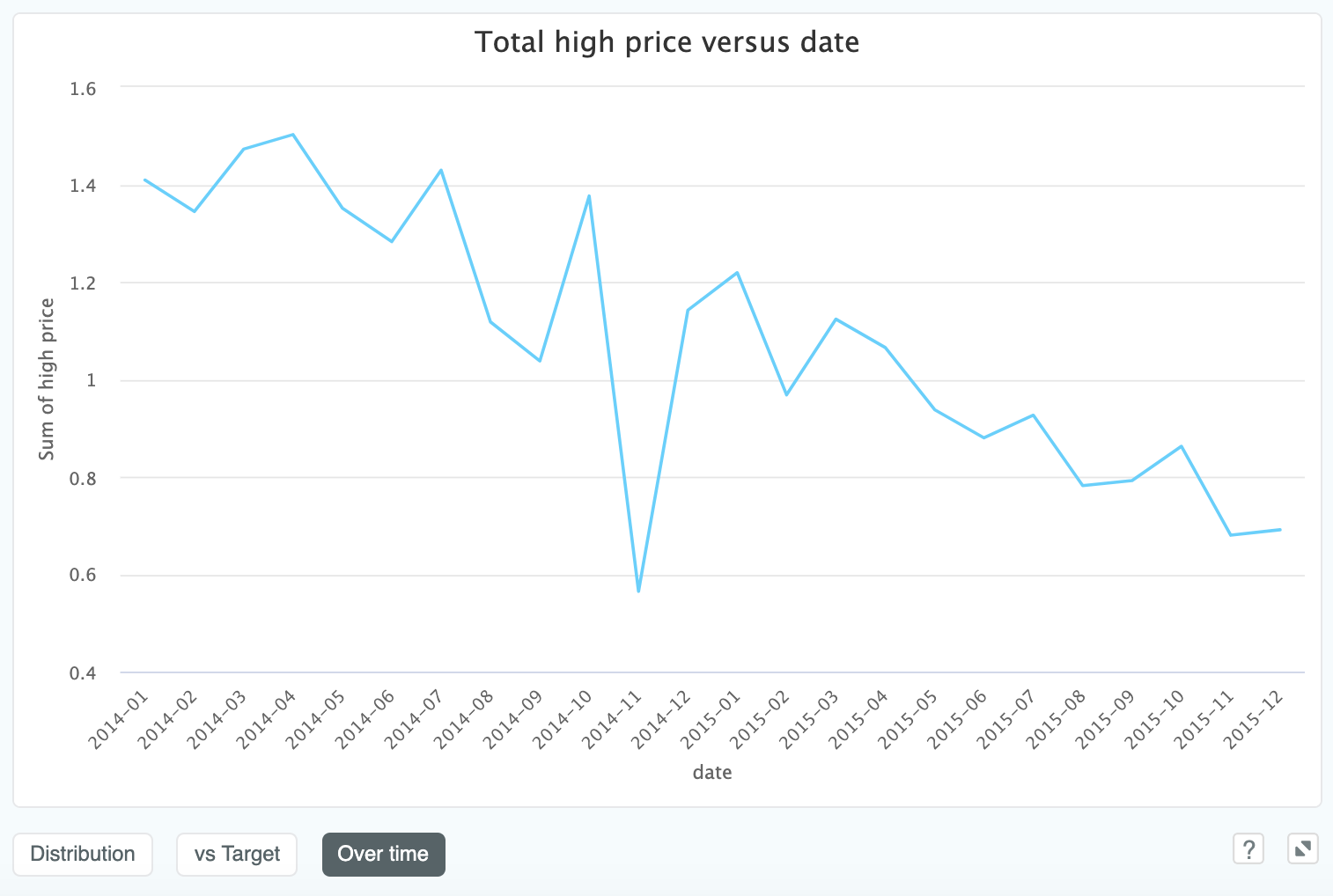
This is useful for time series problems, especially for spotting outliers or missing rows. In this case it shows that price in our dataset is generally trending down, so we potentially want to gather a large time window if we are keen to make longer term predictions against this.
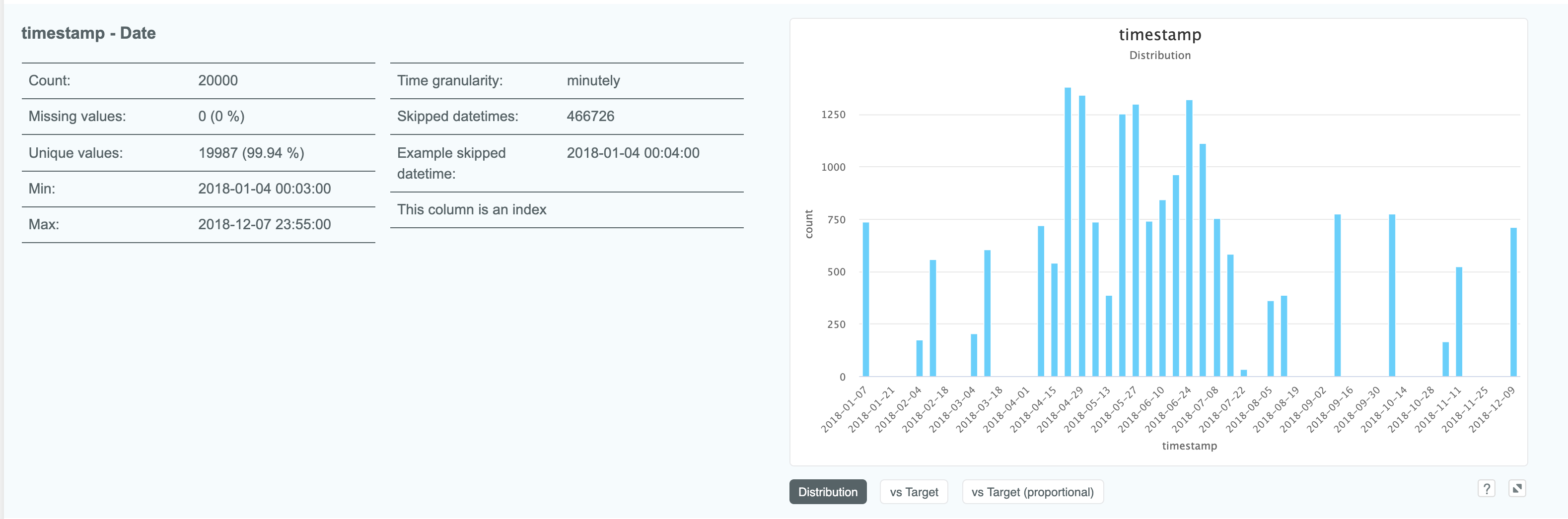
# Column details: date
Expanding a column which is of the date type gives us some slightly different details
to other column types such as time granularity:
We can view a date column against a categorical target variable. This view allows you to visualise the categorical target
over time, and will extend to any number of target classes. In this case, a predictive maintenance dataset, the target is
machine_status which can either be "BROKEN" or "NORMAL".
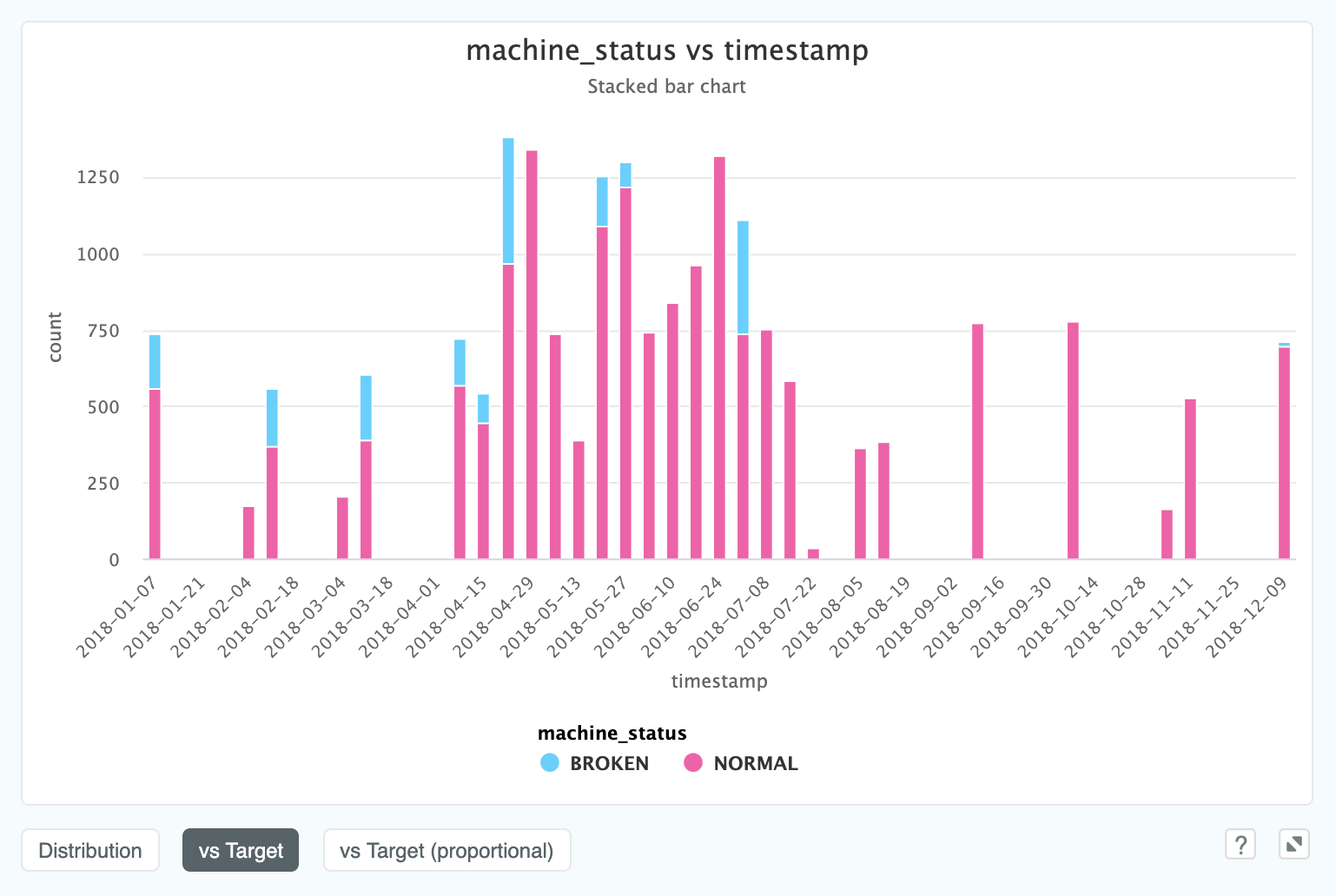
Here we can see that after July 2018 we don't see any machine failures at all. If this was a live predictive maintenance project, we would be very interested in asking the client why this might be the case!
# Column details: categorical
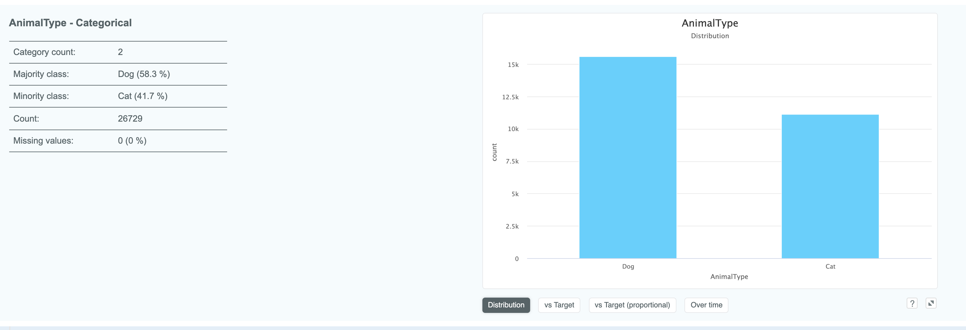
Expanding a categorical column gives you information such as category counts and what the minority and majority values are.
In this example, the target column OutcomeType has five potential values so when we choose vs Target, we see the results
as a stacked bar chart:
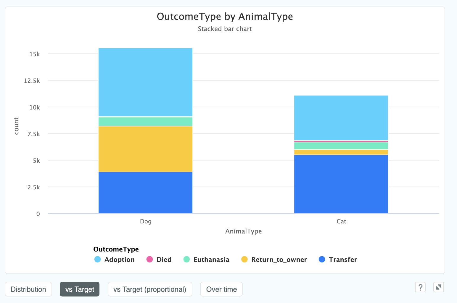
This shows that far more dogs are marked Return_to_owner than cats. This seems like a very stark difference, and perhaps
not what we would expect. If this was a real project, this would be the kind of insight we would want to present back to the
client to understand why this might be the case!
We can also see this proportionally, and since we have a time stamp in this data, we can see this column over time (even though the column itself isn't a datetime column):
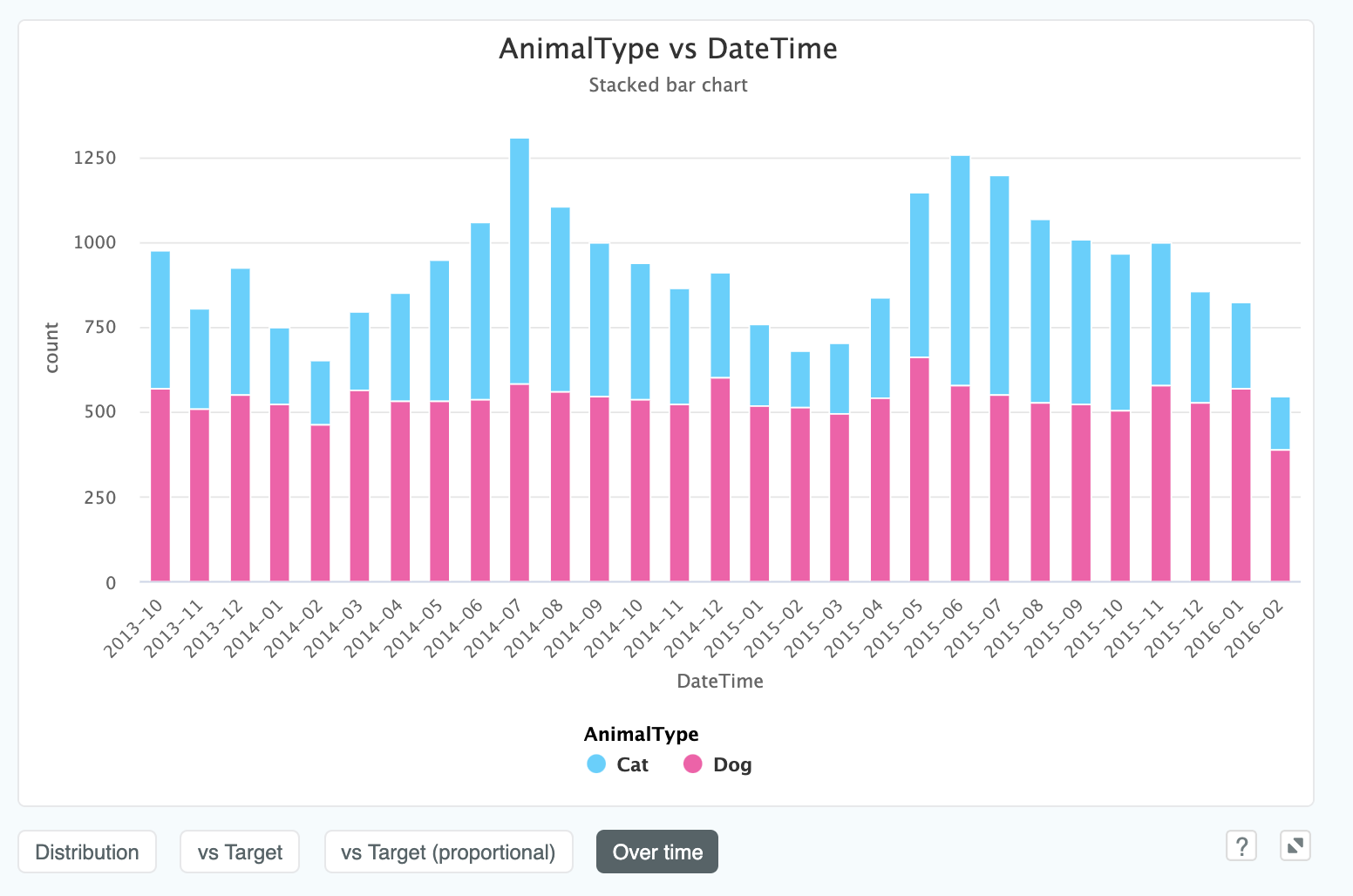
We can now clearly see that the number of cats taken into the shelter increases quite considerably during the summer months where the number of dogs remains constant throughout the year. Another insight that would be valuable to ask the client were this a real project!
In cases where our target is continuous (i.e. a regression problem), our vs Target will show us a Swarm Plot. In this example
we are looking at the effect of a categorical variable, ExterQual (exterior quality), on the subsequent house price SalePrice.
A Swarm plot allows a categorical value to be plotted against a continuous value in such a way that the thickness of the column represents a higher
density of observations of this y value. The below chart shows such a plot looking at the relationship of Neighborhood to SalePrice:
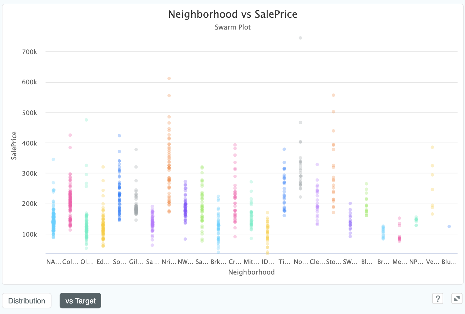
We can see that neighbourhood NA has a tight distribution of cheaper homes, whereas Nri has a much longer tailed distribution
including far more expensive properties.
# Column details: text
Text columns also have some novel properties such as the average, min and maximum number of characters found in words, as well as the most common word and number of unique values. The default graph is a wordcloud, where the size of the word corresponds to its frequency:
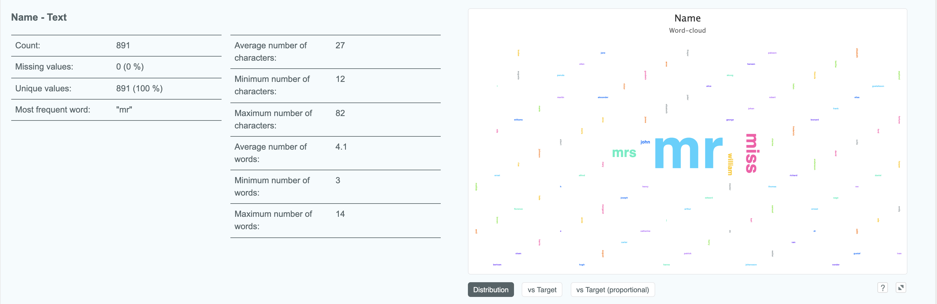
This immediately lets us know that this Name field has a high correlation with Sex, due to gendered pronouns being by
far the most common words.
We can also view a text field vs Target, which will display the 10 most important words as a column chart. If our target is
binary or multiclass we will be able to see the class split described by the column colours:
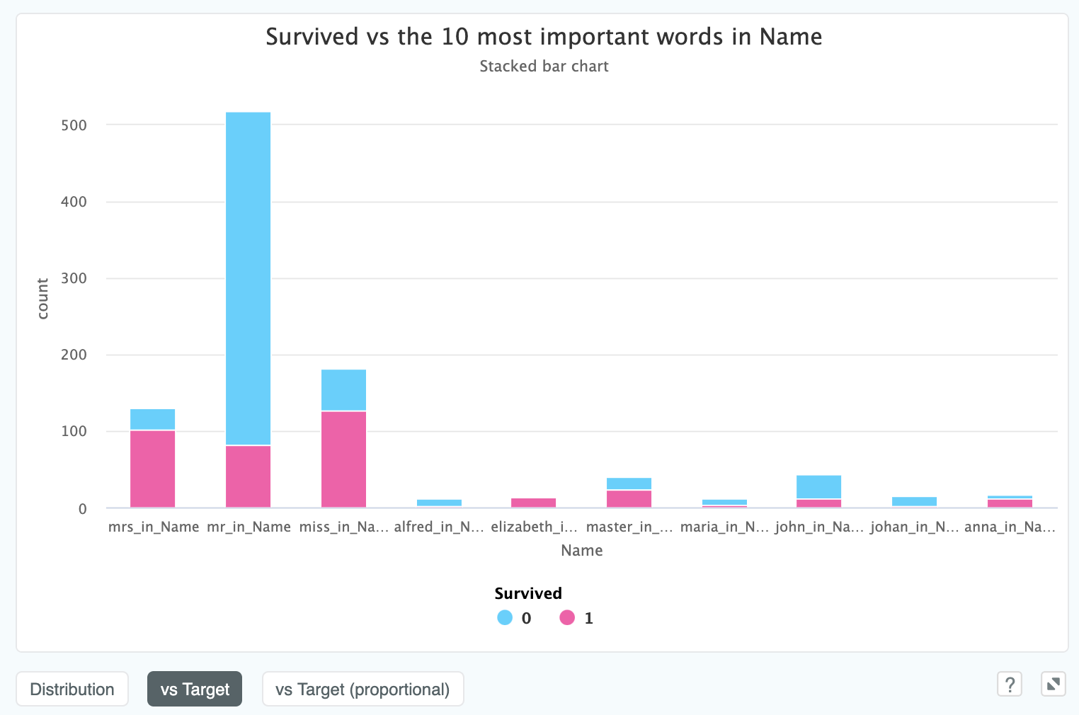
In the above model, taken from the Titanic dataset, we can see that whether your names starts with "Mrs" or "Mr" has quite a material difference on if you survived.
This is also another time where switching to proportional view can help make things clearer - one can clearly see that
those with master in their name had a much higher chance of survival than those who had mr in the name:
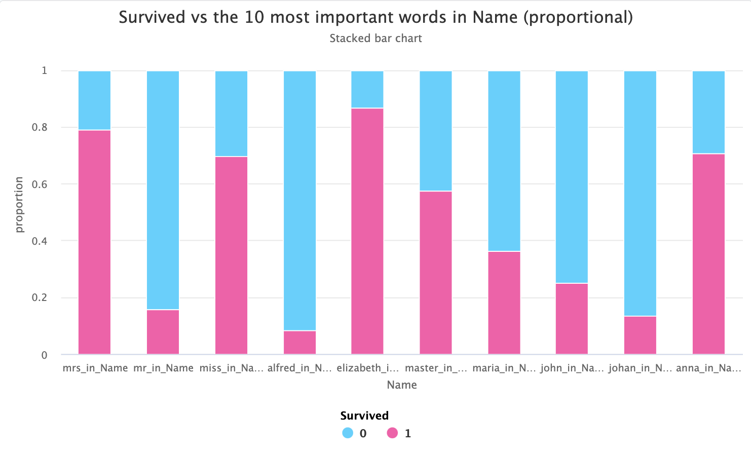
master is traditionally used for young boys, so this would make sense with respect to the women and children first policy!
If our target is numeric we will see a swarm plot instead of a column chart, like in this example where we are predicting the
Age of passengers in the titanic from the text field Name:
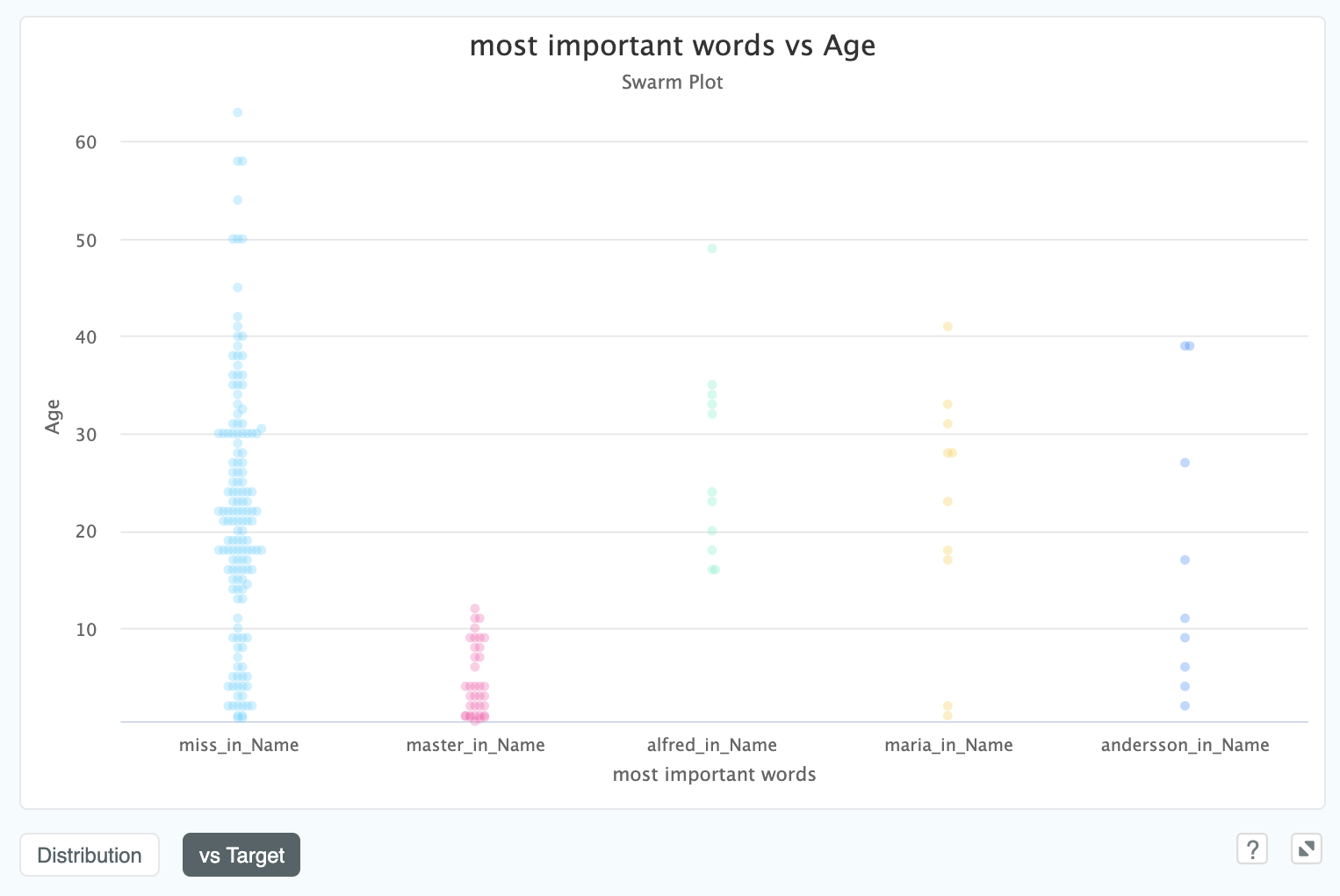
We can clearly see that anyone with master in their name is under the Age of 12, which confirms what we suspected
about the link with Age, and which could also be helpful for cleaning
the Age column in the dataset which has 20% missing values.
# Feature Importances
The feature importance graph ranks your input columns in order of ability to predict the target column. Behind the scenes, this ranking is derived from an ensemble of thousands of different models, which is able to capture interactions between features without bias towards any particular model type.
Note
The feature importances you get out of XGBoost or Random Forests have a well known (opens new window) issue where columns of nothing but random noise will be ranked higher than sparse but informative features - you will find our methodology is robust to this problem!
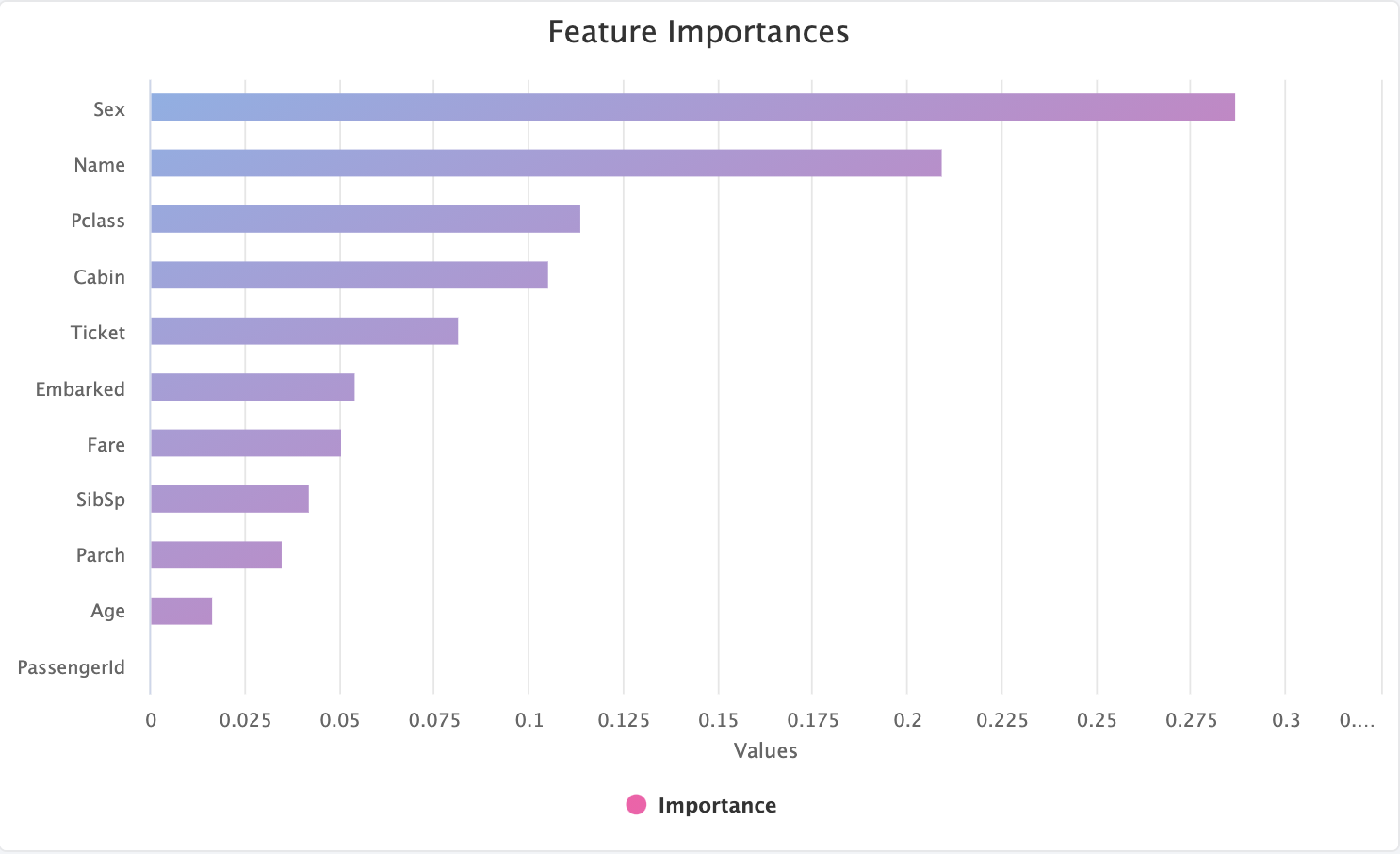
In the above example, on the Titanic dataset, we can see that Sex has been chosen as the most important feature, with
PassengerId as least important. Any feature which has an importance of zero indicates that it is to be dropped by
Feature Selection.
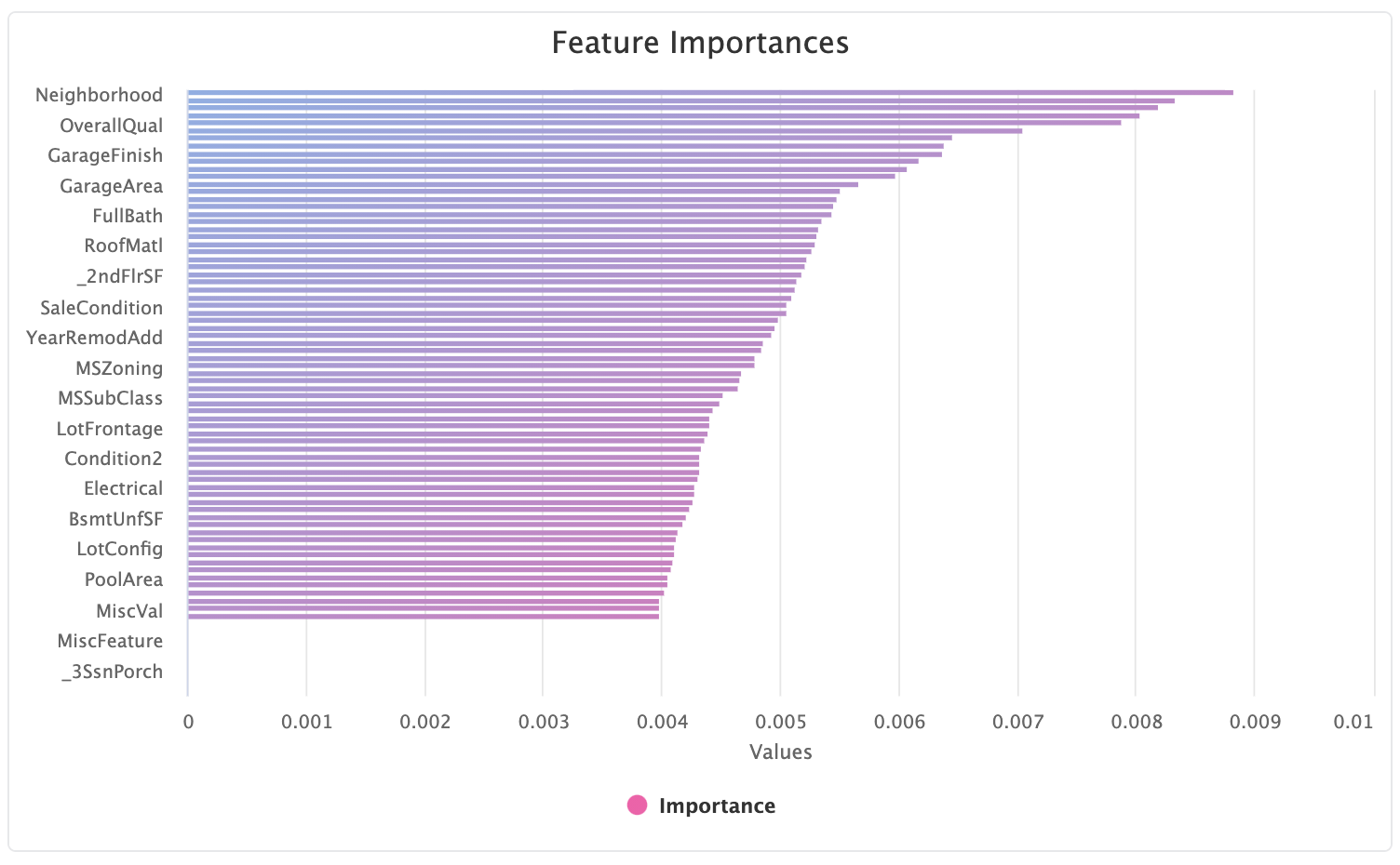
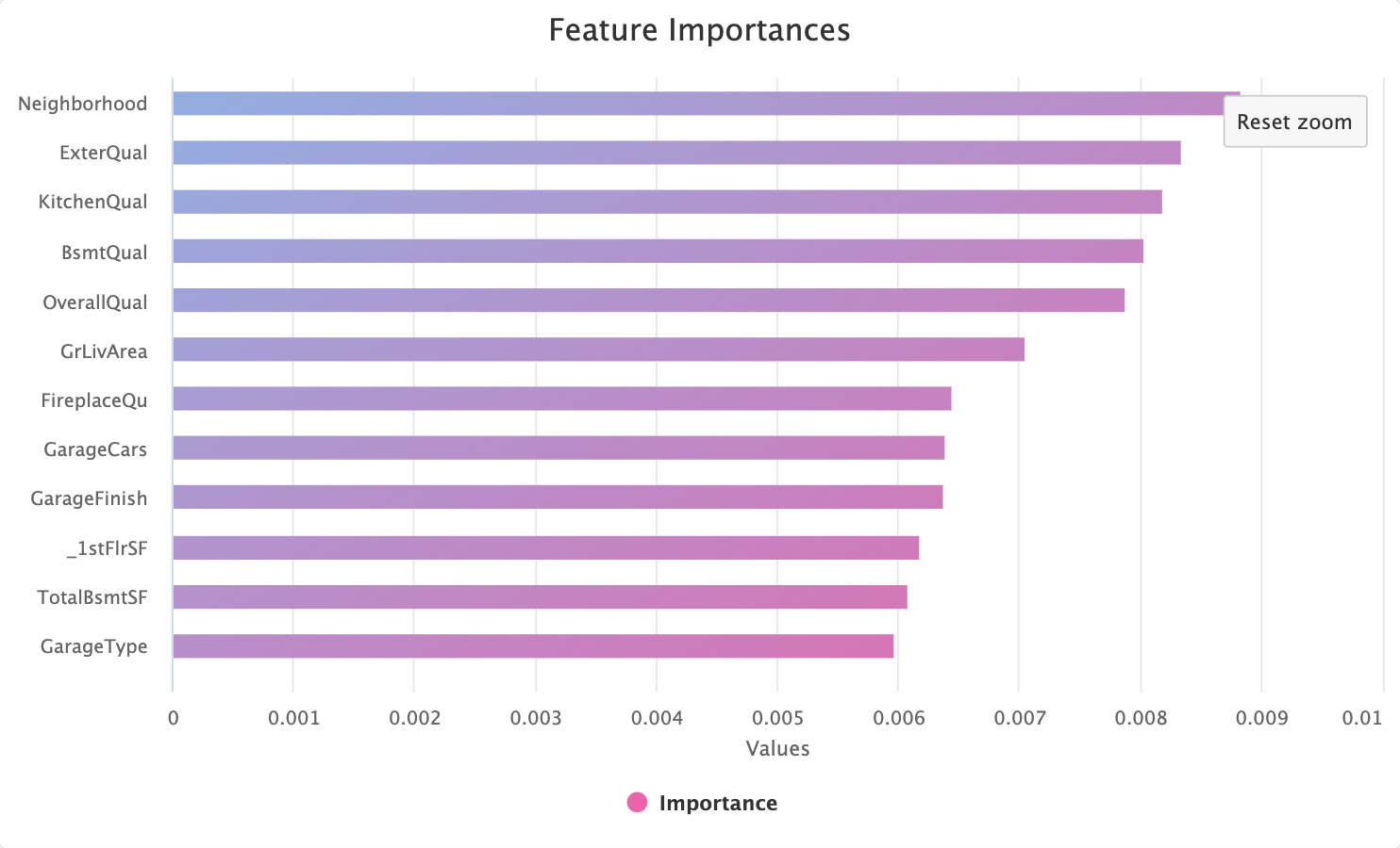
Often we want to understand the feature importances on a larger number of features, like this example on the House Price Regression dataset. The initial high level view will give you an overview but will necessarily hide some feature names to make the graph legible:
Luckily, like all the charts in Kortical, this can be zoomed in to an arbitrary amount:
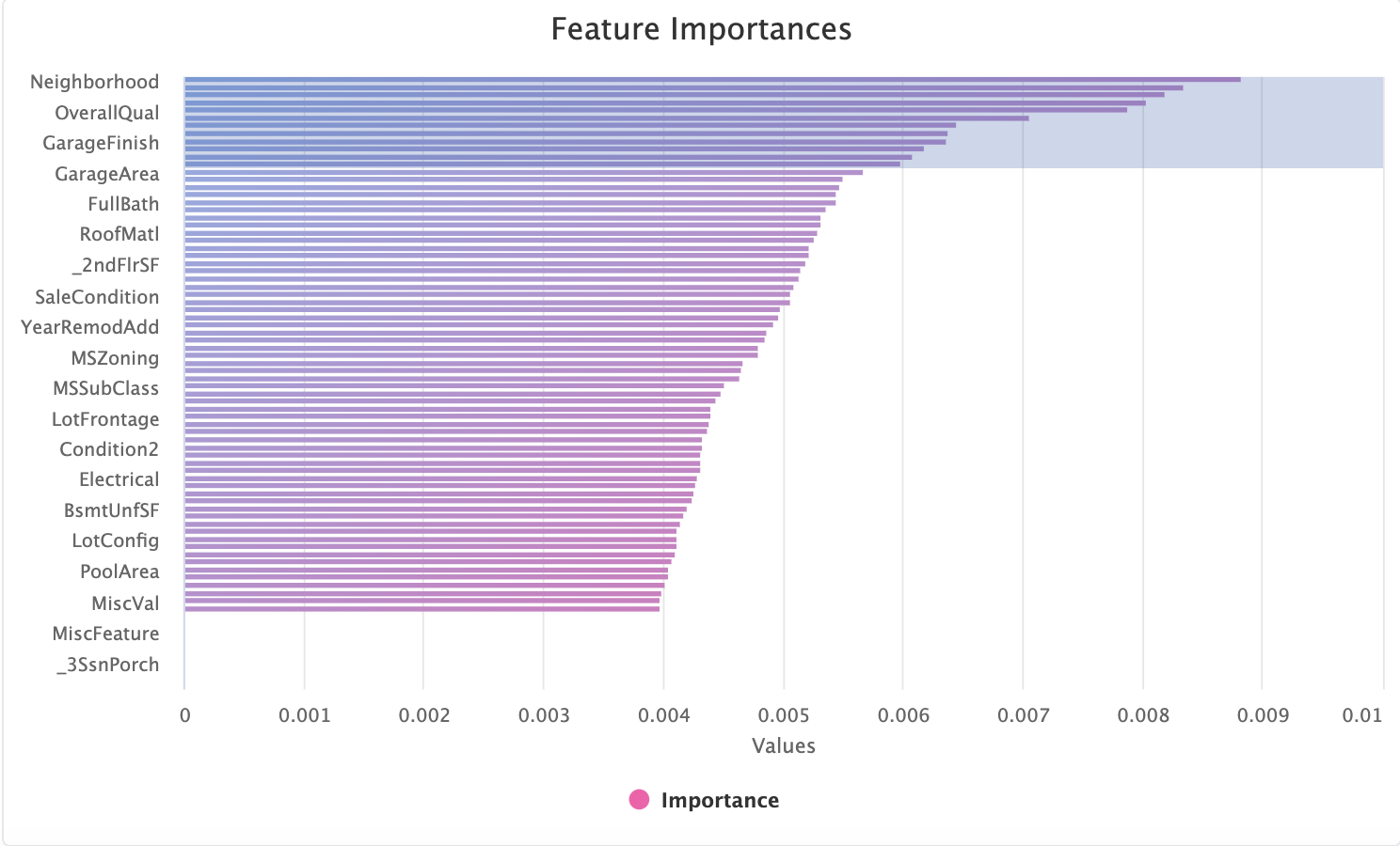
to provide the full set of column names in the zoomed region:
# Feature Selection
Many datasets contain columns which are not predictive of the target. Dropping these features can improve the model accuracy, reduce training time and increase the predict speed in production models.
Note
It is more difficult to drop features prior to model selection, since the features model A considers important might
not be important to model B. Our approach uses an ensemble of many model types along with lots and lots of regularisation to
offset this. We benchmark the methodology against a large set of academic and Kaggle datasets and we find it improves performance
irrespective of downstream model. Check out how our approach to dropping features stacks up against other methods
here (opens new window)
Not all datasets will have features you can safely drop, but if you see the message below, it means we have detected redundant columns.
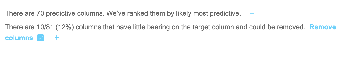
By selecting the blue checkbox we add dropping these columns as an action to take on this dataset.
# Leaky Features
A common pitfall when first building a model is accidentally including a feature which perfectly describes the target you are
trying to predict. For example, you might be predicting if an agent has made a sale, but miss that another column, OutcomeType
which always has a certain value if a sale was made, that would not be known at the time we need to make a prediction.
Including such columns in training has catastrophic effects on the subsequent model, as it will tend to ignore all other
features and report a perfect score.
Luckily ML Data Prep will automatically detect such features and display them to the user:
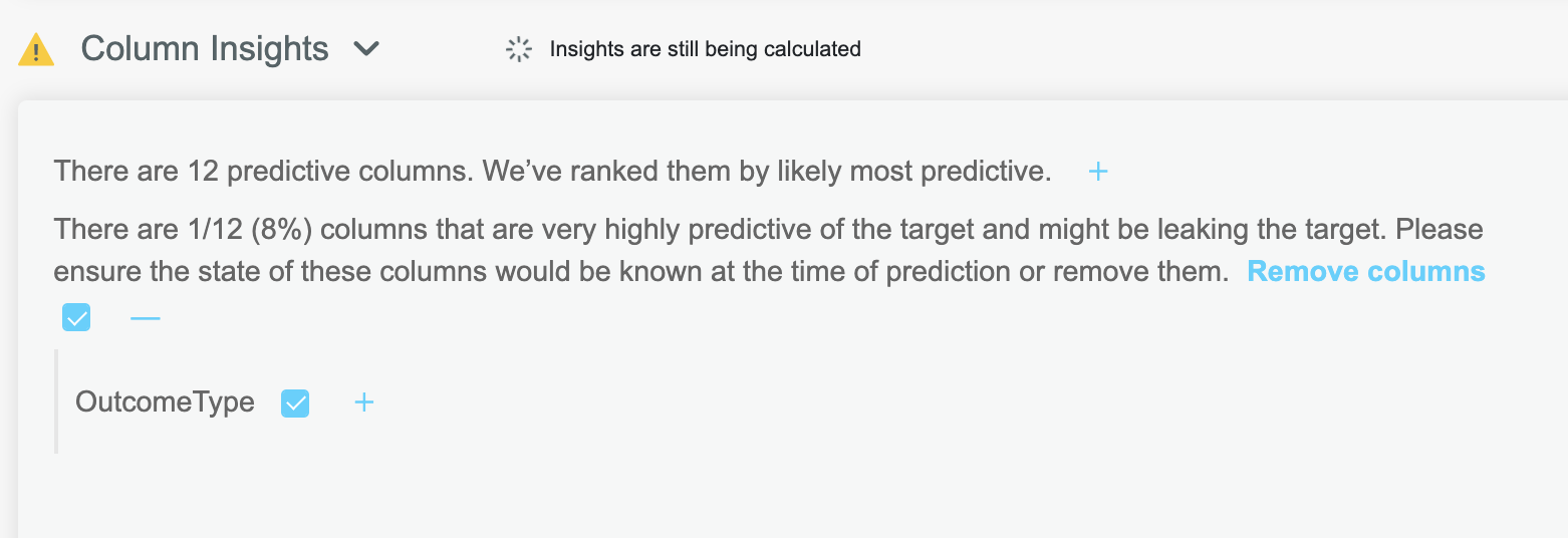
Clicking the blue checkbox will remove these columns during the outcome actions.