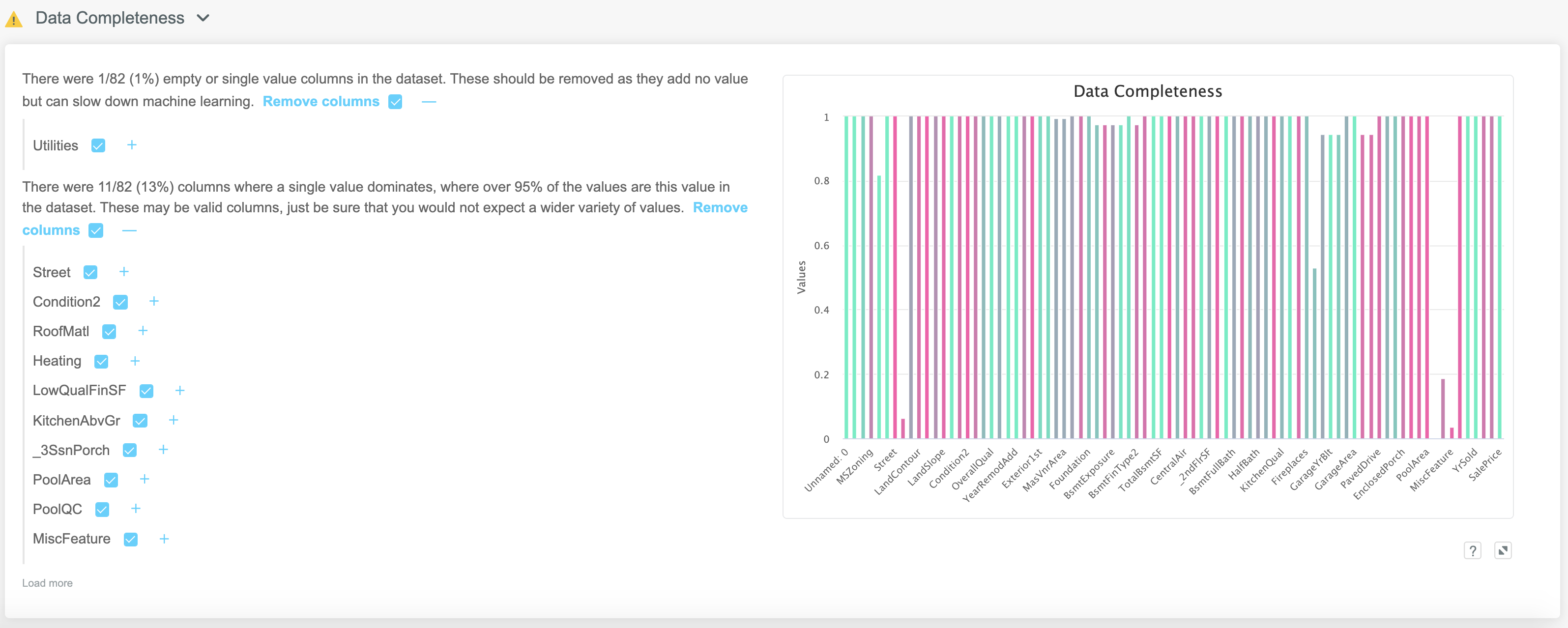
# Data Completeness
Often the first thing we want to know about a dataset is how complete it is. By this we generally mean:
- Do we have columns with lots of missing values?
- Are there columns which are dominated by a single value?
- Is the number of unique values in a given column in line with what we expect?
ML Data Prep allows the user to quickly answer these questions and take appropriate actions. The high level view has a colour coded column chart on the right, with interpretation and actions on the left.
Any columns which contain no information (either by being blank or simply containing a single value) are identified and can be dropped by selecting the blue checkbox:
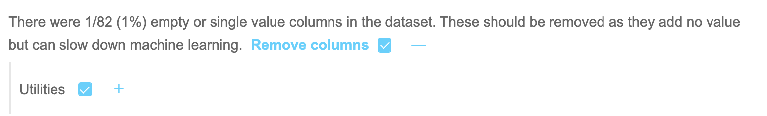
Tip
Anything we can do to safely reduce the number of input features, such as finding columns with just a single value, has a positive impact on accuracy, training time and predict speed of the final model.
Any columns in which over 95% of the observations contain the same value are also flagged up. There is an option to drop these columns, although you may not wish to necessarily do that here, since the Feature Selection functionality has a far more scientific approach to determining if these columns really are safe to drop.
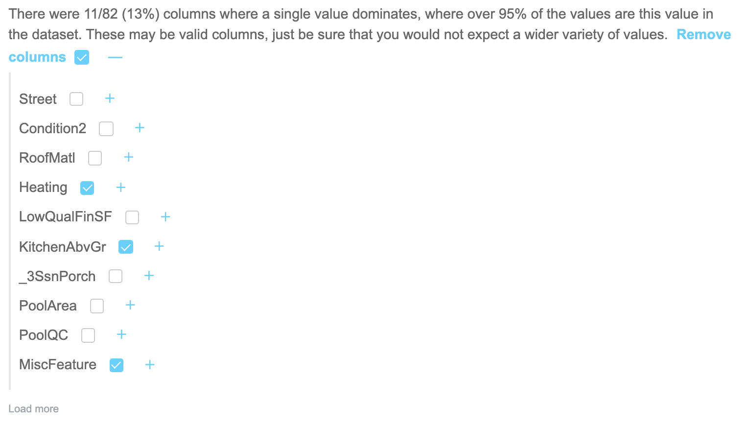
Any features with a check box ticked at this point will have an action to drop them added to the Action Summary at the bottom of the Data Prep screen. This can create a new dataset or train a model with these columns removed.
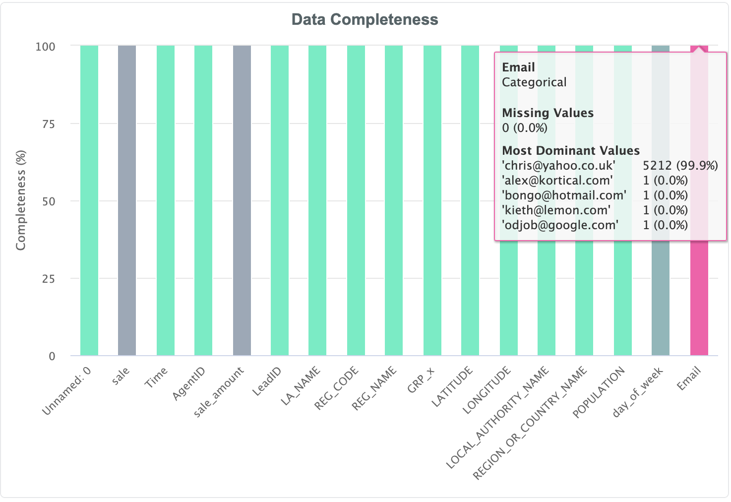
A higher level view is given on the right in the form of the Data Completeness chart.
# Data Completeness Chart
The Data Completeness chart is a colour coded column chart in which the shade of the column and its height indicate properties of that particular feature. The height of each column corresponds to the fraction of missing values while the colour indicates the number of unique values. A green colour indicates a large number of unique values (i.e. high cardinality), with deeper shades of red indicating features which do not have a lot of variety between observations.
Note
Red shaded columns with lower
variety might not have anything wrong with them per se, but intuitively we would expect a column such as Age to have a greener colour
than Sex, for example, so the utility is really around spotting data quality issues.
Hovering over the chart will bring up a tooltip which gives a summary of both the fraction of missing values, and the dominant values in terms of value counts:
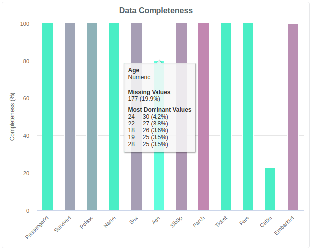
In the above example we can see that although 20% of the values are missing, the remaining values have a reasonably balanced distribution.
However in the below example, while we have almost no missing values, we can see that one value dominates the Email, which is clearly something we
wouldn't expect, and would raise a huge red flag as a data quality issue:
In this way the data completeness chart allows the user to quickly check if the input values are in line with expectations.