# Using Charts
The charts used within ML Data Prep have been designed to be able to show a high altitude view of data at first glance but there may be cases where we have a large amount of content we wish to see the detail of. We have a couple of options to help here:
# Zoom functionality
All of the chart have a drag to zoom function built in:
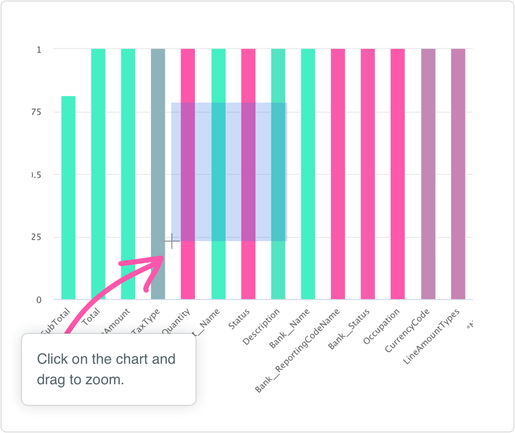
This allows a charts to be zoomed in to an arbitrary amount of detail.
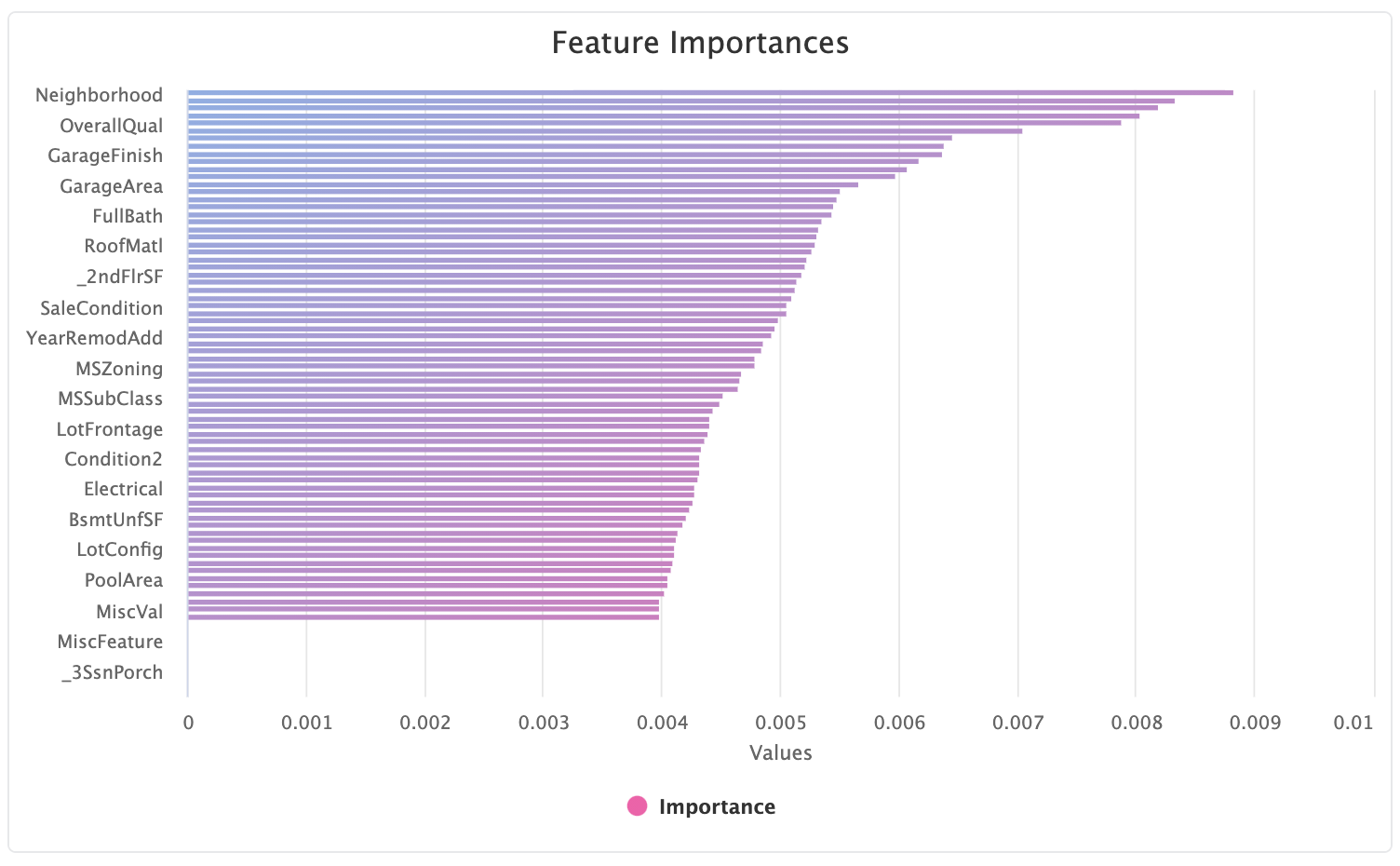
For example, in the below feature importance chart we can't clearly see the top most important features:
We can drag around the region we wish to zoom in on:
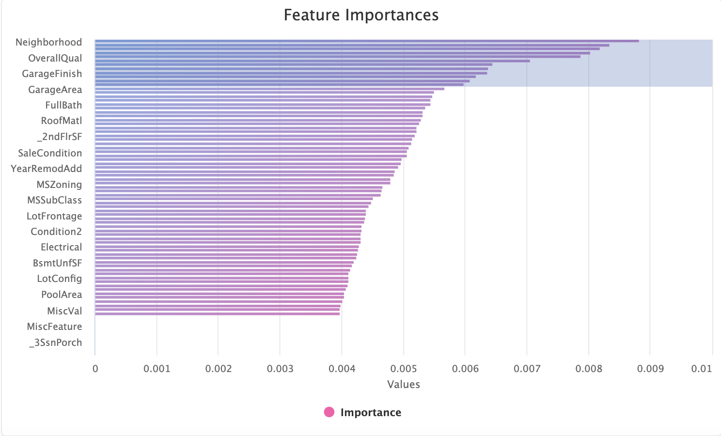
to provide the full set of column names in the zoomed region:
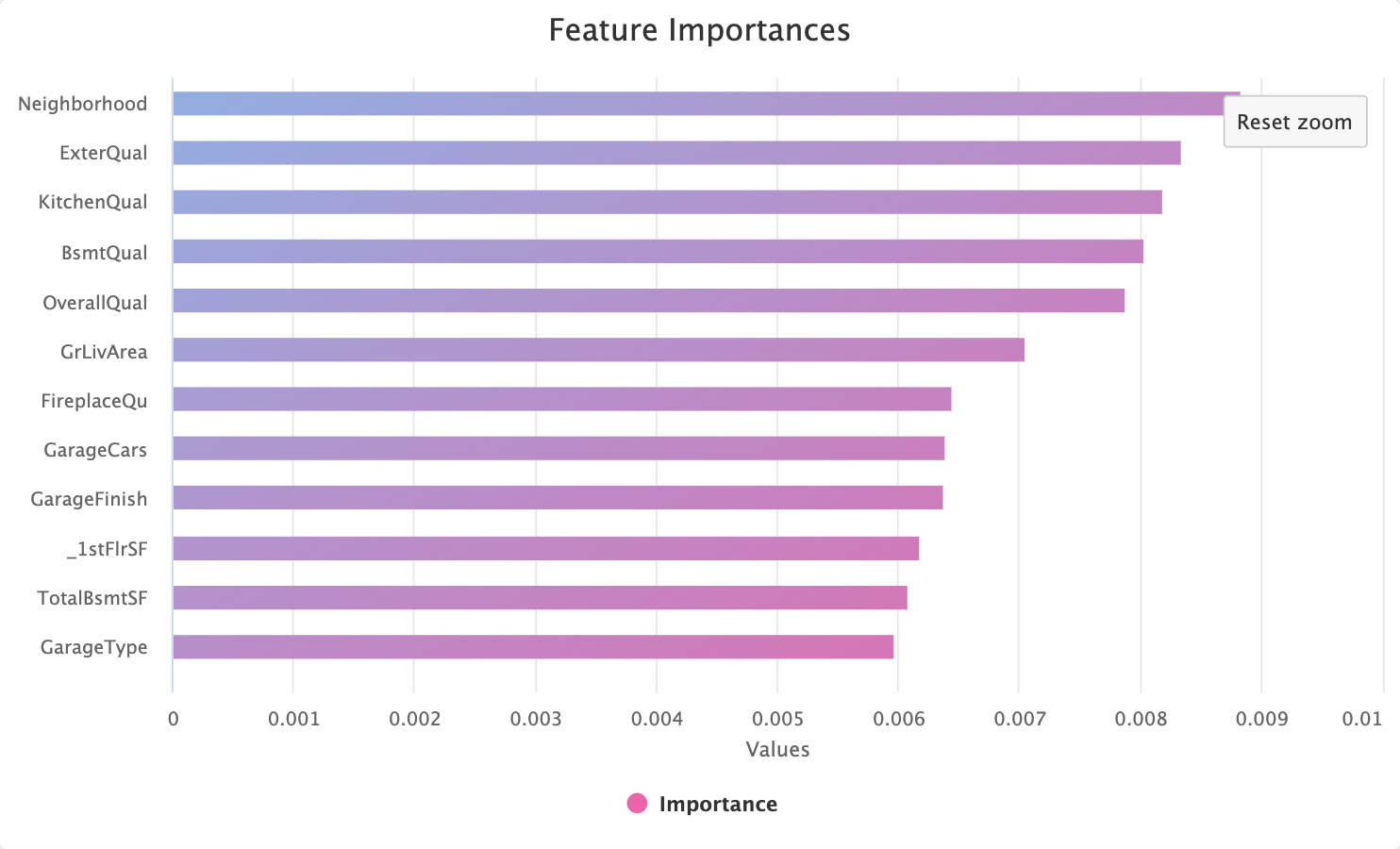
Note the Reset Zoom button which has appeared in the top right hand corner. Pressing this will take the chart back to the
default, maximum, zoom level.
# Full Screen Mode
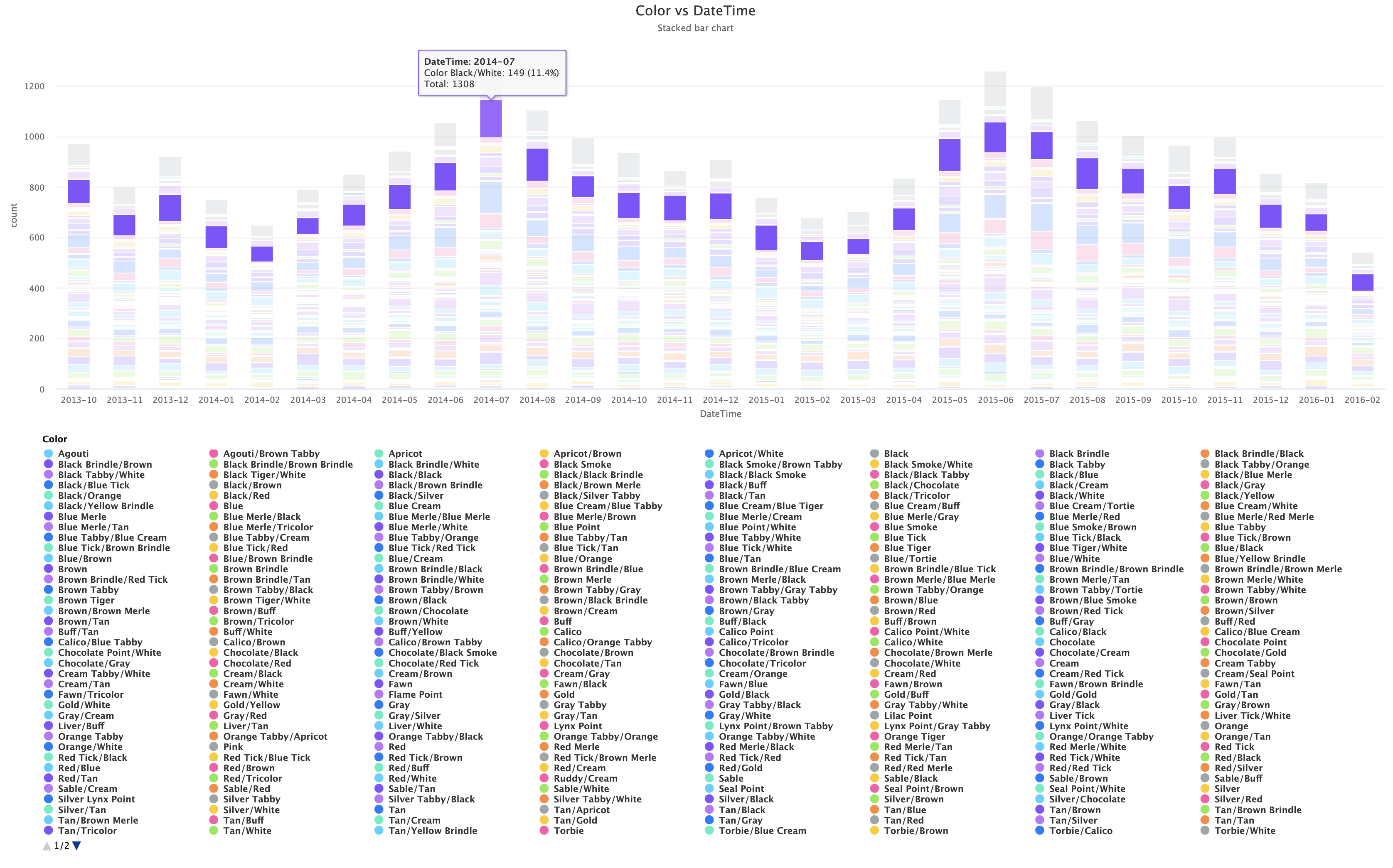
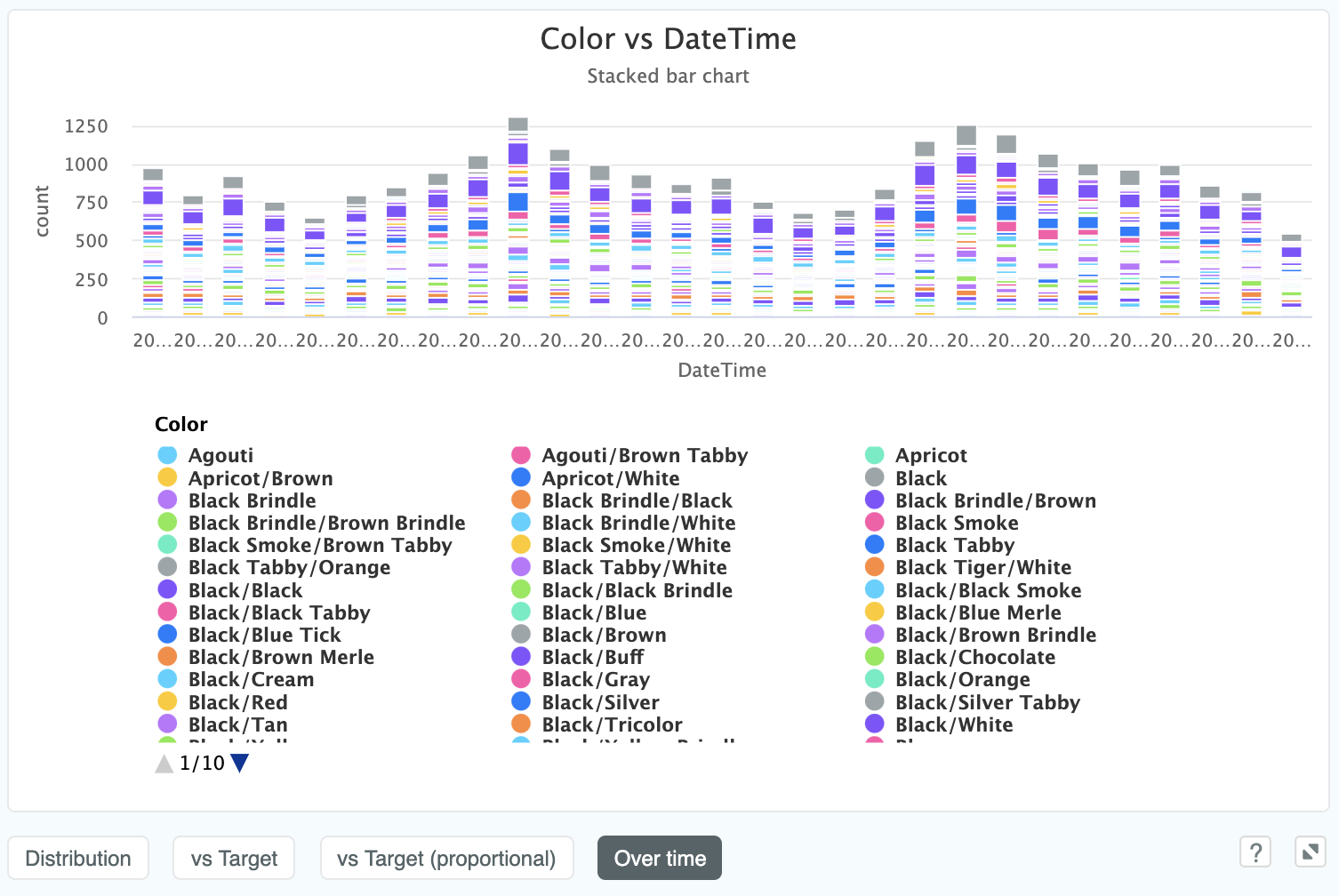
In cases where we can't help but have quite a lot of complexity going on in the chart, like if we plot animal Color over time
in the Animal Shelter dataset:
we have the option to click the maximise the chart by clicking the full screen icon in the bottom right:

which will then make the chart full screen and massively increase its legibility: